A simple logo design holds a whole lot of power to communicate with the viewer and create a strong impact that resonates with them. The main aim of a logo is to represent your brand and communicate your brand values to the consumers. It also differentiates your product from other products available in the same category.
Creating something that carries this massive responsibility can be quite daunting and time-consuming for graphic designers. However, the introduction of AI-powered tools in the field of graphic designing can revolutionize the game.
According to a Forbes report, the introduction of AI can be a major cause behind the fall in jobs of graphic designers by 4% between 2023 and 2029.
A set of core design principles and a creative mind can help in designing a suitable logo design that can appropriately deliver your company’s motto. To further simplify the process, you can all use AI logo creator software for designing a label for your company. If you are looking for ways to effectively map out a logo for your company, we have got you covered.
Let’s check out the key principles of logo design that can help you create a powerful label for your business.
1. Simplicity
The simplicity of a design is what helps the logo stand through the challenges of time. A simple logo is easy to identify, comprehend, and remember. A logo should be clear and easily visible to consumers. A simple yet elegant logo can reflect the aesthetics of your company and can be used to convey your philosophy at the same time. For instance, the Nike logo is nothing more than a monochrome swoosh and is uncomplicated.
2. Originality
With many new companies emerging in different industries and sectors, it is a requisite to design a logo that is unique and attractive. A distinctive logo ensures easy brand recognition and will help create a stronger brand image and consumer base. A successful logo design can be distinguished from others as it is different, original, and unforgettable. A unique logo can be created with an amalgamation of innovative ideas and an artistry mind.
3. Versatility
A good logo must pose scalability and adaptability across different mediums, such as merchandise, print, and digital. The design should be versatile enough to land anywhere, from shop signage to digital ads and more. You must look out to create a responsive logo that can accommodate and adapt to any environment they are placed.
4. Relevance
In an AI-driven and dynamic world, staying relevant can be difficult. An ideal logo design should match and reflect your brand’s ideology and mission. A logo should fit the purpose and should be appropriate for the intended audience. For instance, a logo for a kids’ clothing brand can be playful and full of colors; however, the same cannot be applied to a law firm.
5. Timelessness
A timeless logo is simply a design that will look as fresh and appealing after ten years as it looks today. A designer must not give in to short-lived fads when designing a logo for the brand. Classic designs can stand the test of time and will be relevant even after many years. Additionally, a logo design that is far from the momentary trends is more likely to be perceived as reliable and trustworthy.
6. Balance & Proportion
A well-proportionate and balanced design will definitely catch the eye of consumers. A clean logo will be more appealing to the audience and will attract more customers to your products and services. Striking the right balance between all the elements of your design will give a defined meaning and shape to it. A visual balance will amplify the aesthetic appeal of your logo.
7. Scalability
Your logo should be capable of maintaining its visual integrity and appeal when enlarged or scaled down to a smaller size. A logo should remain legible at any size – be it on a t-shirt or a large billboard. The thumb rule is to create the design in vector format. Vector designs can effectively support rescaling and ensure that your logo looks sharp even when it is reduced to a smaller size or blown to a larger size.
8. Color and Typography
The choice of colors and font should be made carefully, as these can evoke emotions and convey the brand’s ideology to the audience. An appropriate color combination can add depth and dimension to the design making it more appealing to consumers. Along with this, the font style and size must be in proportion to the other elements of the design. The text should be clear and readable
Key Takeaways
A logo is a mark that is simply designed with a combination of text and images. It is used by a business to identify its offering and to differentiate it from its competitors. A good logo must be able to communicate the story and philosophy of your brand to potential customers. Now, before wrapping up the blog, let’s recap a few important points that you must remember while designing a logo-
- Fiddly bits and complicated designs will not be able to thrive in the competitive market. In order to secure the top spot for your brand, you must focus on designing a simple and uncomplicated logo.
- You must define the values and features of your brand through a unique and original logo. A good logo should be based on original ideas and designs to ensure easy brand identification.
- A company will need a logo that can do well on a tiny digital advertisement as well as it does on a huge billboard. It should be able to fit in all the variety and range of products offered by your brand.
- The most important factor in designing a logo is to maintain its relevance and meaning for the company. A brand must be fitting and should be able to fulfill its purpose.
- While designing a logo, you can attempt to achieve something contemporary yet timeless. A good logo should be able to retain its meaning and relevance years after its design.
- Consumers are geared to organize well-balanced designs and images as beautiful. An image or text that is placed on one side should be anchored to the opposite side as well. An accurately proportioned logo will be more appealing and aesthetically pleasing.
- A brand logo must be easy to read and comprehend, irrespective of its size. Logos must be able to support rescaling.
- The font and color scheme used in a logo says a lot about the brand. You must use a quality typeface that goes well with the brand’s aesthetics. The color scheme of your label must be appealing.
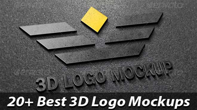
Also read: Free Logo mockups psd & templates
So, these were some of our suggestions and tips that can help you create an optimized and suitable logo for your brand. Constructing ideas, executing, and designing a logo seems to be extremely draining and time-consuming; however, adhering to these guidelines can simplify the job for you.
We hope that this blog on the Principles of an Effective Logo Design was facilitative to you and will inspire and help you in designing a creative logo.
Conclusion
In conclusion, understanding and applying the principles of effective logo design is paramount when creating compelling fitness logos, gym logos, and logo ideas.
By incorporating these principles, such as simplicity, versatility, and memorability, you can create a logo that captures the essence of your brand and resonates with your target audience. It is essential to consider factors like color, typography, and visual elements to ensure your logo communicates your brand’s values and goals.
So, when embarking on your logo design journey, remember to keep these principles in mind and strive for a design that not only reflects your fitness or gym brand but also makes a lasting impact.
Embrace the power of effective logo design to establish a strong visual identity and attract your desired audience. Start designing today and unlock the potential of your logo ideas.


