You can spend a lot of time and energy building the perfect eCommerce website, but without considering your potential customer’s preferences and needs, all your efforts might go in vain.
Regardless of the type of eCommerce business you’re running — whether you’re into Amazon FBA or dropshipping (among other eCommerce businesses) — the experience you provide to your customers needs to be spot on.
Let’s say you’re into dropshipping.
While the cost of setting up your dropshipping business is only minimal, you need to invest in installing other plugins and tools that can help improve your customers’ experience when on your website — things like countdown timers, customer reviews, contests, etc.
Recommended: 12+ Best School Management System PHP Scripts
It is by doing this that your customers’ experience on your website becomes a memorable one — which then leads them to push through with the purchase.
To help you do just that — improve your site’s UX and UI — consider integrating these points into your website.
1. Designated Landing Pages
Can you imagine thinking you’re entering a door to a coffee shop only to find yourself inside a hardware store?
Unless you’re at a funhouse at a carnival, this can be frustrating.
If your website visitors click on the link from your ads and end up on your homepage instead of your product page, they might click away from your eCommerce website in seconds.
Creating a designated landing page allows you to direct your target audiences’ attention to relevant content, such as your product pages, that can increase your conversion opportunities.
If you don’t feel like your current landing pages are performing well, you can use a web scraping service, or simply explore competitor sites to see what you may be able to incorporate into your designs.
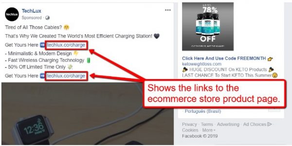
For instance, if you are running a dropshipping store, you can run a Facebook ad with a link that points your target customers to your website.
See Also: The 18 best SEO plugins for WordPress in 2024
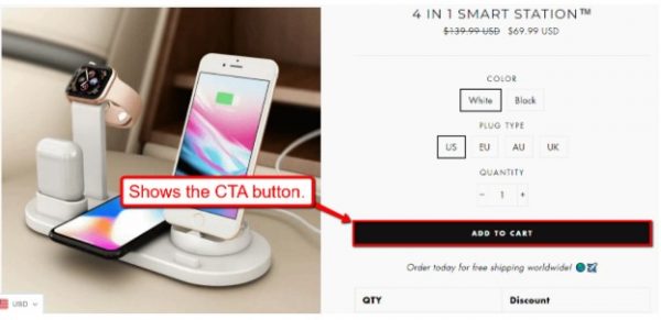
Once they click on the link, they will land on your product page, giving them the relevant content that they need.
This allows you to direct your target customers’ attention to your product and your “Add to Cart” or “Buy Now” buttons — increasing your chances of converting them into buyers.
While there are several methods you can use to market your dropshipping store, you’d be far less effective if you didn’t use dedicated landing pages when funneling your audience from third-party sites into your website.
Doing so can improve your user experience, lower your bounce rates, and raise your dropshipping store conversions.
Read Also: Key Differences and Tips To Understand UX and UI
2. Website Search Option
Your website visitors’ primary goal in visiting your site is to find solutions to their problems that your products can address.
However, the key to giving a great user experience is to make finding products easier and faster for your potential customers.
With a site search option, your visitors can find products more efficiently, instead of manually going through all your product catalogs one by one.
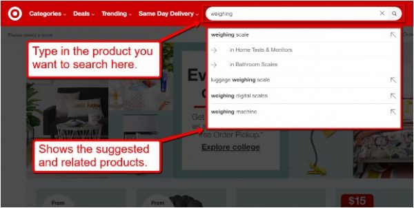
Retail companies like Target offer a product search option on their website.
Target’s site search option also uses predictive features that “anticipate” what you’re looking for as you type in the product keywords.
Plus, the predictive feature shows your target customers’ related products that they weren’t thinking of initially buying but might consider purchasing now that they’re in plain view.
It’s a great way to subtly market your other products while improving your site visitors’ user experience at the same time.
3. Simple Checkout Process
Keep in mind that your potential customers want the easiest and fastest ways to make a purchase.
After all, one of the benefits of online shopping is not having to deal with long lines at the checkout lane.
By simplifying the checkout process, you can offer a smoother user experience since your customers are not burdened with complicated or lengthy steps to buy your products.
Here are some tips to simplify your checkout process:
- Ask for basic user information. As much as possible, ask for the minimum details required for your customers to shop. You can always ask for additional information from returning customers later on.
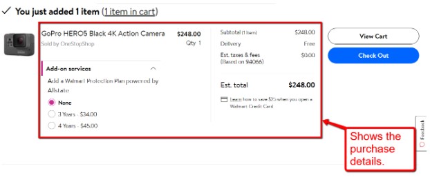
- Show clear customer purchase details. Allow customers to view their purchase details before proceeding to the payment page.
This way, your customers can check the product’s quantity, and amount, and verify that there isn’t anything unwanted or extra in their cart.
- Redirect to your relevant pages. Once your customers complete their purchase, show them the completion page.
You can suggest related products on the same page or a button that leads them to a separate page that lets them track the product delivery progress.
4. Intuitive Website Navigation
When designing your website navigation, you need to consider how it would make your visitors feel and the kind of experience they’d have.
For instance, if you place too many icons and items in your navigation bar, it can make your navigation menu look overcrowded, which would overwhelm your site visitors.
When it comes to your site navigation, simplicity should also be your priority.
Here are a few tips to help you design intuitive navigation for your eCommerce website:
- Minimize the number of clicks. Don’t make your site visitors go through a maze to get from your catalogs to your checkout page.
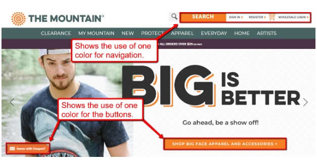
- Group your items and type of content into colors and shapes. Using color schemes and shapes as markers to direct users can simplify navigation and keep the consistency of your design.
- Ensure your layout looks natural. Including unnecessary and distracting elements in your design will only drive your website visitors away.
Avoid using weird-looking color combinations, unreadable font sizes and styles, intrusive animations or pop-ups, and annoying sounds that can ruin the whole user experience.
Keep in mind that intuitive website navigation is a crucial factor in establishing a successful online business.
Plus, prioritizing functionality above your site’s aesthetics can help you establish an eCommerce website that offers your potential customers a better user experience.
5. High-Quality Images
Aside from videos, images are the elements in your website that let your potential customers see your products.
If you use low-quality or boring photos, your site visitors will tend to move on without taking a second look.
By using high-quality photos, you can entice your customers or at least convince them to take a closer look at your products.
Let’s say you’re selling business apparel for women, and you use professionally taken photos that include models wearing your products.
By using high-quality photos, you are showing your products in the best way possible.
It’s also a great way to trigger emotions from your target audience that compel them to purchase.
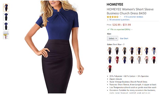
Investing in professionally taken product photos might cost a bit more than your DIY images, but the cost far outweighs the benefits, with potentially huge returns.
6. Virtual and Augmented Reality Features
The application of Artificial Intelligence technology in e-commerce is growing, which makes it a crucial aspect to include in your bank of basic UX design skills for product management.
With AI, your customers can “interact” with your products through virtual reality experiences such as 360-degree view images and visual search (among other things).
As an example, IKEA offers an app that allows users to virtually “place” IKEA products in their homes or spaces.
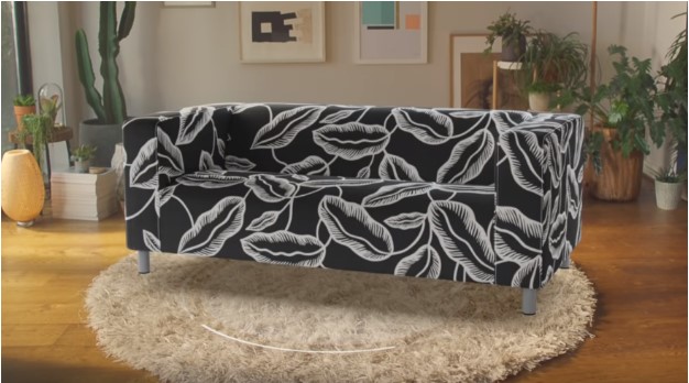
Using your smartphone’s camera, scan the space where you want to place the IKEA product.
Once you’re done scanning, you can choose the furniture that you want to purchase, move it around adjust it to your liking, and “place.”
This kind of shopping experience allows your customers to see how the product would look and fit in their space all while doing everything from their smartphones.
With virtual reality, you can offer your eCommerce site visitors a personalized, convenient, and memorable shopping experience that can translate into increased sales.
Final Thoughts
There is no single formula for designing the perfect eCommerce website, but taking note of the essential UI and UX web design elements can be your building blocks to success.
Remember that your customers, their preferences, and needs which can translate into profit are at the heart of your web design goals.
When you give your target customers an incredible shopping experience, they’re more likely to purchase and buy again.
If you found this post helpful, please click on the share button. Cheers!


