38+ Best About Me Page Examples for Websites and Blogs
An About Me page is a crucial element of any business website or portfolio. It serves as a first impression, helping visitors understand who you are and what you offer. A well-crafted About Me page not only captures attention but also provides essential information about your background, skills, and personality. By infusing your unique style into the design, you can make your page more engaging and memorable.
While professional web design companies can create an About Me page for you, crafting one yourself allows for a personal touch that resonates with your audience. To help you get started, we’ve compiled some of the best About Me page examples and expert tips for writing an inspiring bio. These examples will offer creative ideas for structuring your page, making it visually appealing, and ensuring it effectively represents your brand.
If you’re looking for inspiration, simply browse through the examples below. Click on any image to see the full About Me page in action and discover ways to make your own stand out.
Tips to write an inspiring “About Me Page”
Before creating an About Me, you should know exactly what the purpose of this page is and where you are writing it. Following are a few tips to help you make an “About Me Page” for your blog/website, which will look more impressive and attractive.
These About Me page examples are super cool! They show how to tell your story in fun and simple ways. But guess what? Your brand isn’t just online. It can shine in the real world, too! Try enhancing personal brand presence in physical spaces like your desk, your store, or even your outfit. Use your favorite colors and style everywhere. This way, people remember you faster. So, mix online and offline magic—and let your brand shine bright!
Be Authentic and Engaging
People visit your About Me page to learn about you. Be original, honest, and open. Readers appreciate when you share both your strengths and weaknesses. Adding personal stories can make your page more compelling and hold attention better than generic details.
Keep It Concise
Avoid making your About Me page too long. Readers prefer engaging and to-the-point content. If your page starts to feel repetitive or dull, wrap it up with a strong closing statement.
Design with Purpose
Your About Me page should not only look appealing but also serve its purpose effectively. Choose colors and styles wisely—sudden shifts between bold and soft tones can create a poor user experience. A well-balanced design enhances readability and engagement.
Highlght Your Achievements
Share impressive academic or professional experiences to showcase your expertise. Readers appreciate insights into your background, whether through education or hands-on experience.
Clarity Matters
Use clear, simple language to avoid confusion. A well-structured page with easy-to-read sentences keeps visitors interested and encourages them to explore further.
Add Personal Touches
Including a favorite quote or life, philosophy adds depth to your page. Explain how it inspired you to create a stronger connection with your audience.
Engage Your Readers
Dedicate a section to your audience. Share your expectations, goals, and how they can connect or contribute.
Finally, ensure that your page’s theme, color scheme, and design align with its content for a cohesive and professional look.
Read Also: Best Tips for a Successful About MeWebsite
About Me Page Examples
Janis
This artistic page from Janis is very eye-catching and attractive. The artist’s life, thoughts, and aesthetic style are displayed with the help of soothing colors. The large picture makes the page more captivating.
See Also: 200+ About Me Quotes For Profile Bio
Mangools
Mangools worked hard as a team. They’ve built many tools after the massive success of KWFinders.com. Take a look at their about me page.
See Also: 12 Super Creative Interactive Online Resumes Examples
Egopop
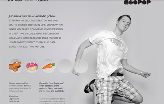
The About Me page for Egopop includes a large picture of the designer with his biography and history in a simple way.
Mark McGall
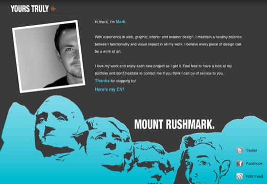
Mark’s About Me page is skillfully done with the superimposition of the face on Mount Rushmore. This feature adds a certain kind of exclusivity to the page.
See Also: 20 Best Flat Design Examples
Toby Powell
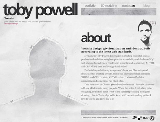
Toby Powell’s page is another example of a simple yet stirring about me page. It induces the readers to explore more about the owner. View
Lord Likely
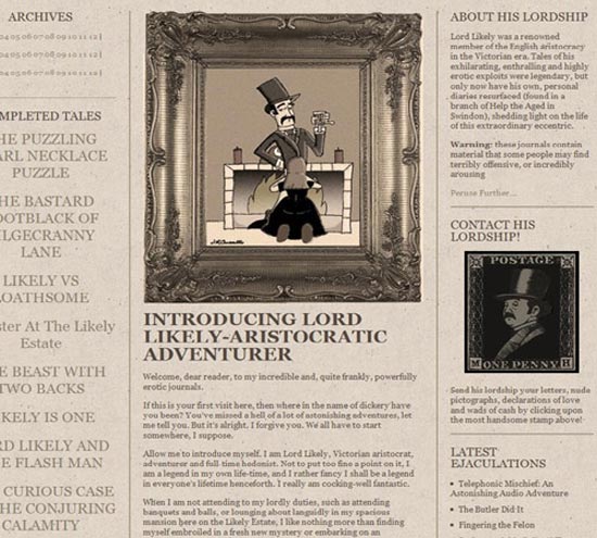
This page is inspired by the Victorian era theme with old-world style in an attractive way. The old style makes it impressive for readers.
See Also: 22+ Fashion and Clothing website design ideas
Guomundur
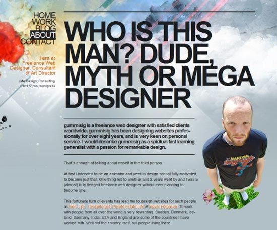
This designer from Sweden made his About Me page inspiring and unique by taking an overhead shot of himself, unlike the usual pictures. With bold typography, the page’s visual interest has been enhanced.
Floating Asian Kid
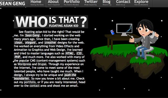
This page is intriguing and captivating, with a beautiful design. The Concept behind the floating Asian kid displays the owner’s thoughts in an inspiring way.
Read Also: How to Hire the Best Web Designer for Your Business
David DeSandro
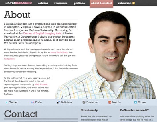
This about me page includes a wonderful combination of rightly chosen colors and clear typography. The page is both modest and fascinating.
James A. Reeves
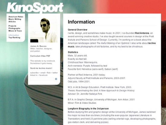
This page from James A. Reeves is a neat and simple example of an inspiring About Me page. It allows the large-scale photography in the background of a page. View
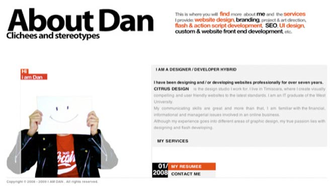
Dan – About Me Sample
This is another example of a simple and to-the-point About Me page. The addition of a large self-portrait makes the page more in connection with readers.
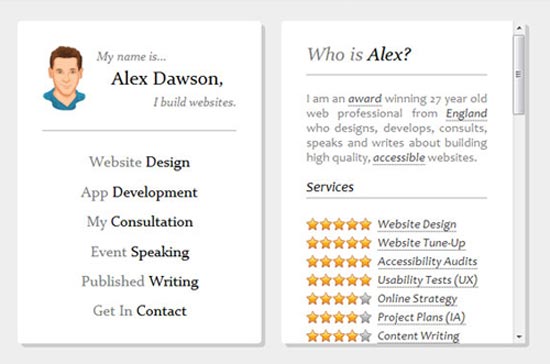
Alex Dawson
Alex Dawson presents his About Me page in a very simple and functional way. The page is created in a way that makes it easy to browse through the desired information.
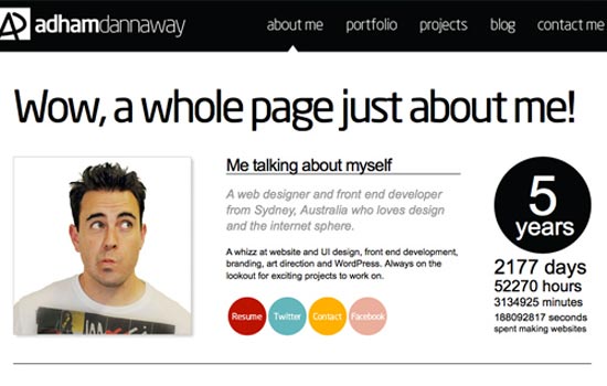
Adam Dannaway
Adam Dannaway’s page is a simple and to-the-point illustration of his ideas and skills. The simplicity in an attractive way makes it more inspiring.
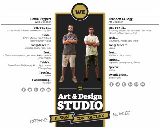
Superfluent
The guys over at Superfluent Design came up with an about page that spoke to their personalities. You get to know little quirks about them as well as hire them for projects!
Yellow Leaf Hammocks
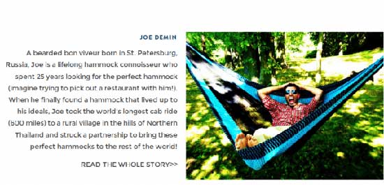
Yellow Leaf Hammocks is a company trying to save the world via hammocks. The brand plans to accomplish this by selling hand-woven hammocks from artisans in Thailand.
The idea alone should be enough to make this a brand worthy of your attention (and money), but the story of how founder Joe Demin discovered these hammocks and the statistics regarding poverty found on the About page are equally compelling. Both humanize the brand, company, and product, which should motivate you to purchase a hammock.
X (Twitter) – About Me Page
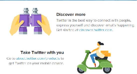
Don’t be fooled by the lack of bells and whistles on Twitter’s About page. It’s there for one purpose. To get you to sign up for the social network. If you browse through the page you’ll notice interlinking everywhere.
These links will eventually take you back to the Home page, which is where Twitter wants you to land since that is where visitors sign up. It’s a very effective tactic.
Station Four Agency
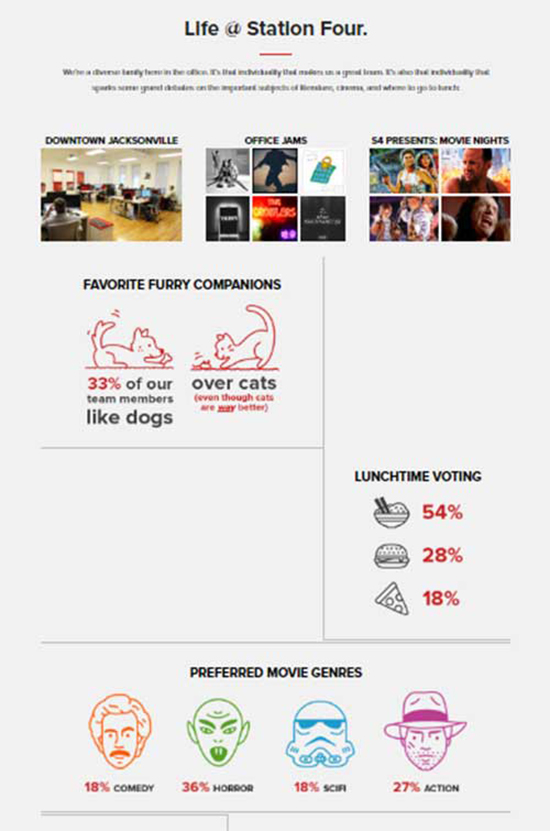
As a team of professional strategists, developers, and marketers, we excel at applying the right plan and technology to achieve our clients’ objectives.
Smart Web
A creative digital agency with 10 years of experience in web development. Specializing in e-commerce websites based on the Magento platform.
Tumblr
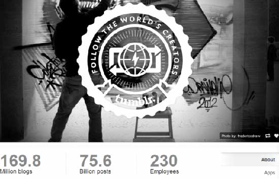
Tumblr has a near-perfect About Page. It’s clean, easy to digest, and provides all of the important information front and center, such as how many blogs or the number of employees. If you keep scrolling, however, you’ll also be treated to the latest blog posts, which are usually based on trending topics. It’s fun and informational!
Tobi
Not many companies do as good of a job at creating a successful About page as Tobi. Tobi uses their About page to convey the basics of their company and help you understand the basics of their company.
DigitalTrend
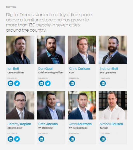
DigitalTrend is one of the leading tech magazines. Which is extremely recommended for highly tech lovers. Take a look at their About Me page, the way they showed up their team is amazing.
Sara Sadik
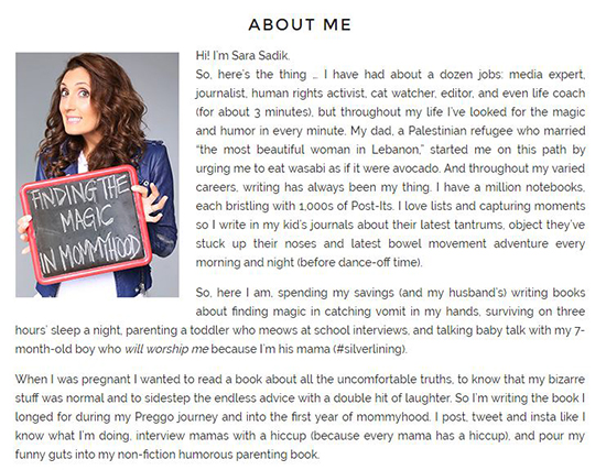
The tagline of Sarasadik’s blog is “Finding The Magic In Mommyhood,” which will explain almost everything about her site. Sara has had about a dozen jobs: media expert, journalist, human rights activist, cat watcher, editor, and even life coach for about 3 minutes.
Time2project
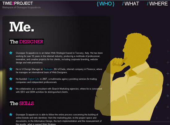
The project is being led by Giuseppe Scappaticcio, who is an Italian Web Strategist based in Tuscany, Italy. He has been working for over 10 years in the internet industry, producing a multitude of professional, innovative, and creative projects for his clients, including corporate branding, website design, and web promotions.
Pointless Corp
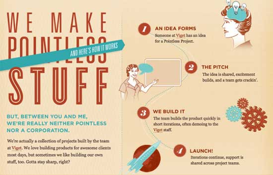
What makes Pointless Corp’s company about page so useful and fabulous is that it not only looks extremely cool and creative, but it points to all of the things they’ve created when they created them, and the purpose of each of their projects.
Moz
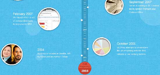
Moz decided to provide visitors with a timeline to tell their story. But the site didn’t go overboard with details. Instead, the SEO consulting firm only shares highlights with circular images on a track, which you can easily scroll through. With this method, Moz can showcase its awards and accomplishments without coming across as a show-off.
LessFilms
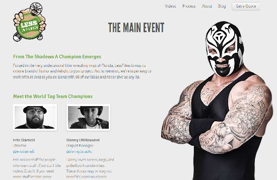
LessFilms is a video production company that decided to show off its wit and sense of humor by basing its entire site on wrestling. Yes. Professional wrestling. Somehow, the duo makes it work. The result is an original and unique page that gives LessFilms a lot of personality. The personality that would make us feel completely comfortable hiring the company for film production needs.
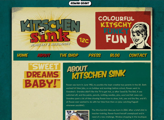
Kitschen Sink
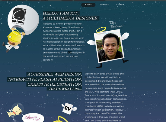
Kitfolio
Bright Bright Great
Bright Great is a branding and design agency that has chosen to showcase its team members creatively in a series of mugshots.
Andrew Reifman
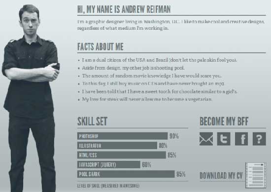
If you make your living doing freelance work, then you know how important it is to not only sell people on your talent, skills, and resume but also on who you are.
In that area, Andrew Reifman succeeds. The graphic designer includes all of the important information required on an About Page but presents it in a comical and almost video-game-themed way. It gives you an idea of who Andrew Reifman truly is and what his personality is like.
829llc
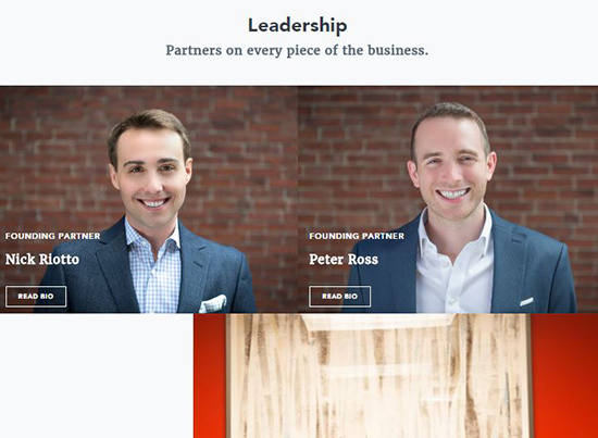
829 Studios is a Boston-based integrated agency with a passion for performance marketing.
Amazeelab
Joseph Payton
Jaredigital
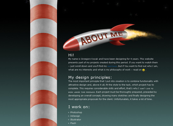
Grzegorz Kozak
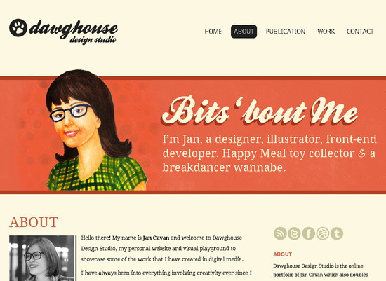
Dawghouse Design Studio
Crane Brothers
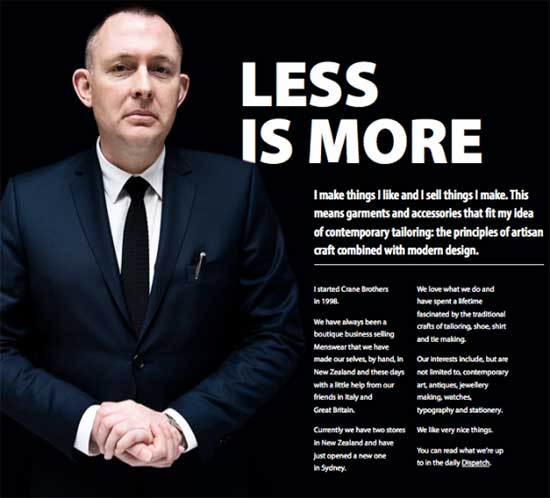
Crane Brothers does an excellent job of keeping their About page short and to the point with a minimal amount of information, but just enough to help you get the information you need and find out how to contact them.
Final Thoughts
A well-crafted About Me page is more than just an introduction; it’s a powerful tool to engage your audience, showcase your personality, and establish credibility. Whether you are a freelancer, a business owner, or a brand, an inspiring About Me page can make a lasting impression.
By incorporating storytelling, maintaining clarity, and balancing aesthetics with functionality, you can create a page that truly represents you. From creative visuals to compelling narratives, the examples highlighted in this guide demonstrate the many ways you can design an impactful About Me page.
Remember, authenticity is key—be honest, concise, and engaging while sharing your journey. A touch of humor, a personal anecdote, or an insightful quote can add depth and relatability. Ultimately, your About Me page should not just inform but also inspire and connect with your readers. Hope you liked above mentioned creative About me Examples, Do Share your views in the Comments. . . Cheers :)
So, take the time to craft a page that reflects your unique voice and vision, ensuring it aligns with your brand’s message and goals. Have you come across an About Me page that stood out to you? Share your thoughts in the comments below!








This is exactly what I am looking for about making about page. I am currently on the updates about my about page. Thanks for the idea.
Thank you for commenting :)
if you’re planning to create a inspiring about me page.. kindly do share you page with us so that we could publish at our site ..
Thank you once again
thank you very informative post :)
w’ll definitely help to make my about me page
Thank you for commenting .. yap make one and share link with us :) thank you :)
Nice collection. here only i learn how to design about me page to attract all the visitors . reAlly great.
i will add it on my website now to create wonderful about me page
thank you !!
Thank you for commenting and appreciating this post. :)
thank you for this informative post.currently working on about me page.
Unique collection of “About Me” pages :) It’s really useful to build one.