iWatch Concept Blends Apple And Nike Fuelband [video]

” width=”660″ height=”371″ class=”aligncenter size-full wp-image-1312″ />
iwatch apple price : apple fuelband : apple iwatch price : iWatch Concept : iWatch Concepts
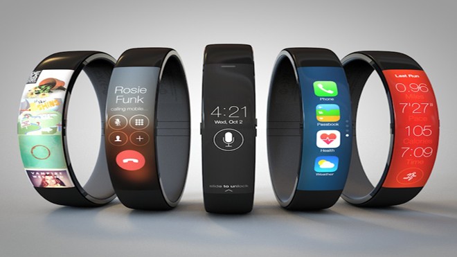
Young User interface designer Todd Hamilton has this week published his latest Apple Concept designs and a video for his iWatch, which builds on a previous iWatch concept created by designer Thomas Bogner back in October of last year.
[alert]See Also : 3D Light Sculptures Created with Two Rotating Flat Monitors[/alert]
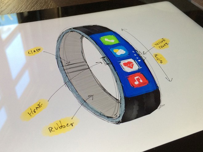
In Thomas’s iWatch concept the user interface required you to twist your wrist to be able to view the screen but now Todd has tweaked this to make it easier and more ergonomic to use. Watch the video after the jump to see Todd’s iWatch concept demonstrated in more detail.
appla : appler : pple : appe : appel : iwatch apple : Nike Watch : Bike Fuelband
Todd explains a little more about the inspiration behind his iWatch concept design:
[quote]
“A few months ago Thomas Bogner posted an iWatch mockup on Dribbble that looked like a marriage between a Nike Fuelband and an iPhone. It was an impressive concept that got a lot of people excited including myself. However, it had a major flaw: the orientation of the interface made it impossible to use.
See also: How Much Does It Cost to Build a Video Conferencing App in 2021
I had some free time over the holidays so I decided to take a stab at the problem and create a more user friendly concept. I wanted to retain a slim form factor like the Fuelband and incorporate familiar UI components from iOS 7. It needed to feel natural on the wrist and look like something Apple would actually produce.”[/quote]

” width=”660″ height=”495″ class=”aligncenter size-full wp-image-1313″ />


SHUT UP AND TAKE MY MONEY!!!
lolx :P